Watercolour painting tutorial
Learn to paint ~ Colours and Tone
 In order to learn how to produce lovely watercolour paintings you will need a working knowledge of colours and tone. A mixture of two of the primary colours of red, blue and yellow make the secondary colours of purple, orange or green.
  From the colour wheel on the right, the red through green colours are known as warm colours whereas the purple through green colours are cold
colours. In landscape paintings, for example you will notice that colder colours are used in the distance and the warmer colours in the foreground. Using the colour wheel, you can see which colours contrast with each other. Contrasting colours are on opposite sides of the wheel, for example red contrast with green, yellow with purple and blue with orange. Armed with this information, artists can use colours with striking effect. An example of contrasting colours can be seen on the left where the red sail of the dinghy constrasts well with the greens of the far hills. Also, the red in the reflection on the water creates a splash of warmth in the coldness of the lake.
From the colour wheel on the right, the red through green colours are known as warm colours whereas the purple through green colours are cold
colours. In landscape paintings, for example you will notice that colder colours are used in the distance and the warmer colours in the foreground. Using the colour wheel, you can see which colours contrast with each other. Contrasting colours are on opposite sides of the wheel, for example red contrast with green, yellow with purple and blue with orange. Armed with this information, artists can use colours with striking effect. An example of contrasting colours can be seen on the left where the red sail of the dinghy constrasts well with the greens of the far hills. Also, the red in the reflection on the water creates a splash of warmth in the coldness of the lake.
 On the watercolour equipment page, I suggested that you include the following
colours to your palette: French Ultramarine, Winsor Blue, Cadmium Yellow, Raw Sienna, Burnt Sienna, Light Red, and Paynes Grey. You will note, that there are two blues, one yellow and one red, therefore you will be able to mix all manner of greens, browns and purples. When starting out it can be useful to use a sheet of watercolour paper on which you experiment with your different water colours. Not only will this exercise give you an idea of the true colours but also how the colours mix together. A watercolour doodle such as the the one on the right can be handy for future reference.
On the watercolour equipment page, I suggested that you include the following
colours to your palette: French Ultramarine, Winsor Blue, Cadmium Yellow, Raw Sienna, Burnt Sienna, Light Red, and Paynes Grey. You will note, that there are two blues, one yellow and one red, therefore you will be able to mix all manner of greens, browns and purples. When starting out it can be useful to use a sheet of watercolour paper on which you experiment with your different water colours. Not only will this exercise give you an idea of the true colours but also how the colours mix together. A watercolour doodle such as the the one on the right can be handy for future reference.
Watercolour tone is effectively the strength of the colour you use: the more water you use the less tone the wash will have. It is worth noting that watercolours tend to dry lighter than they look when wet! On the painting above, the distant hills have less tone than the sail of the dinghy. Therefore, contrast and tone can be used to draw the viewers eye to certain aspects of your watercolour painting.
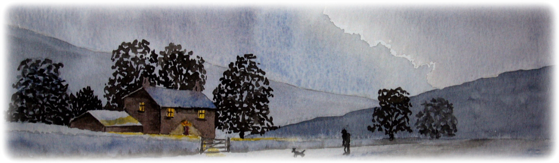
As you learn to paint with watercolours I recommended that you practise painting a near monochrome painting, such as the one below. I used three colours Cadmiun yellow, Payne's Grey and Ivory Black. I started with the sky, using a strong Payne's grey wash but leaving blank paper for the silver lining of the cloud. Once dry, I applied another wash of Payne's grey for the distant hill and, when that was drying I added more paint to the wash for the nearer hill on the right. The tone of the farthest tree is less than the others, thus giving a perception of distance. The trees behind the building were painted last and their dark tone brings out the shape and character of the buildings.
Art Links
If you have an art related website and would like to exchange links, please click here.
Art and Design
Web design by zero78

